February 2021
* logo was not created by me or the company I worked for.
Novantatre : Italian-inspired Architecture in Luxembourg
My team was hired to further develop the brand-identity of an up and coming architect in Luxembourg. This involved designing and building a new website, implementing the brand into social media and generating effective SEO. I personally handled the design, development and deployment of the project, from web design to digital design, social media & SEO.
See the site at : https://www.novantatre.lu/
Visual Design :
* the chosen Facebook banner from a series.
I was tasked with creating the entire Social Media presence for Novantatre on Facebook, Instagram and on LinkedIn. I would need to create, banners, posts, carousels, and Insta-stories. Later, once the site was developed. I would implement the SEO.

On Facebook, businesses often utilize carousels to promote, so it was important that I implemented one as well :
For Facebook, I created 9 additional posts to be posted on a scheduled basis :
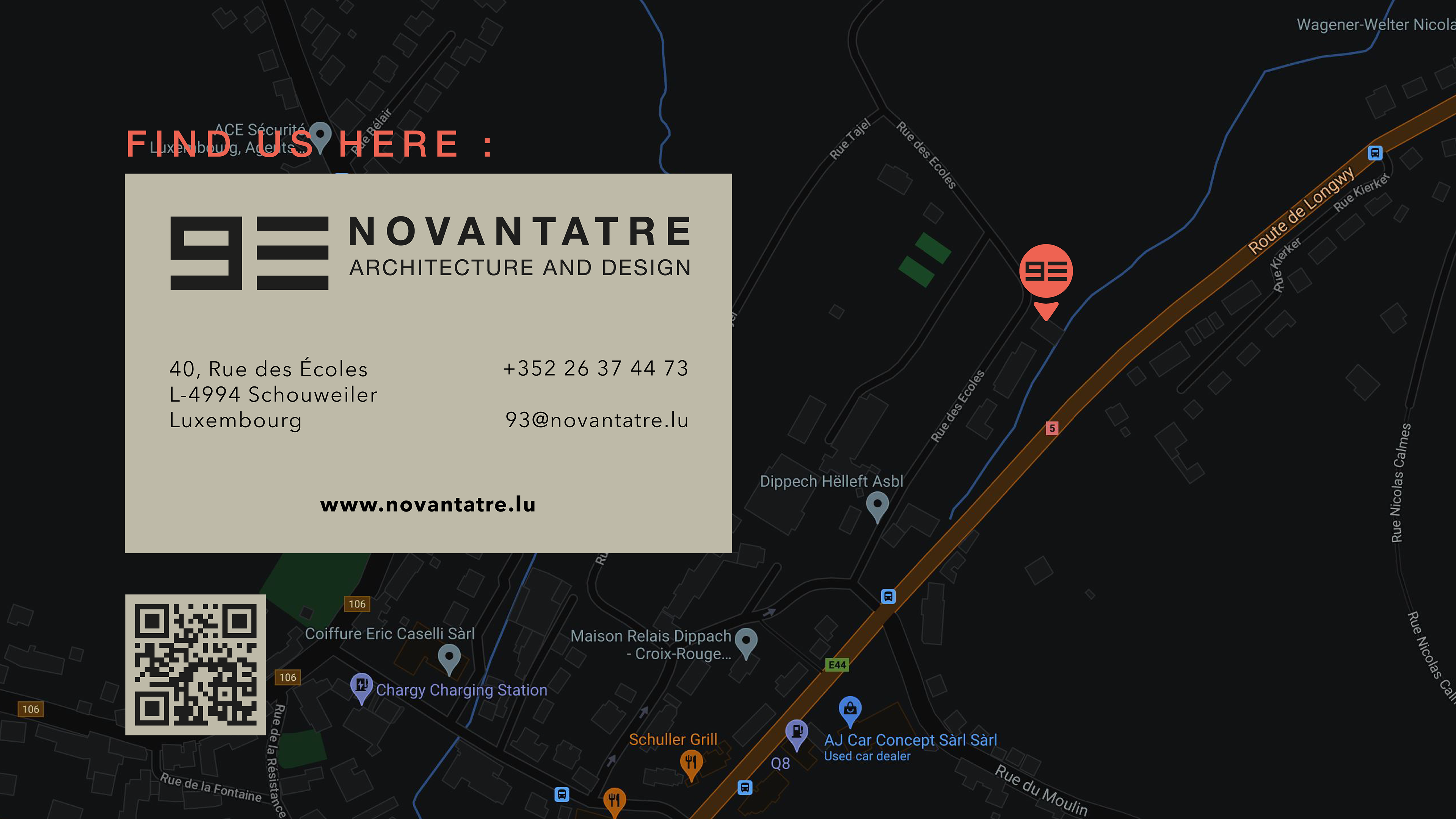
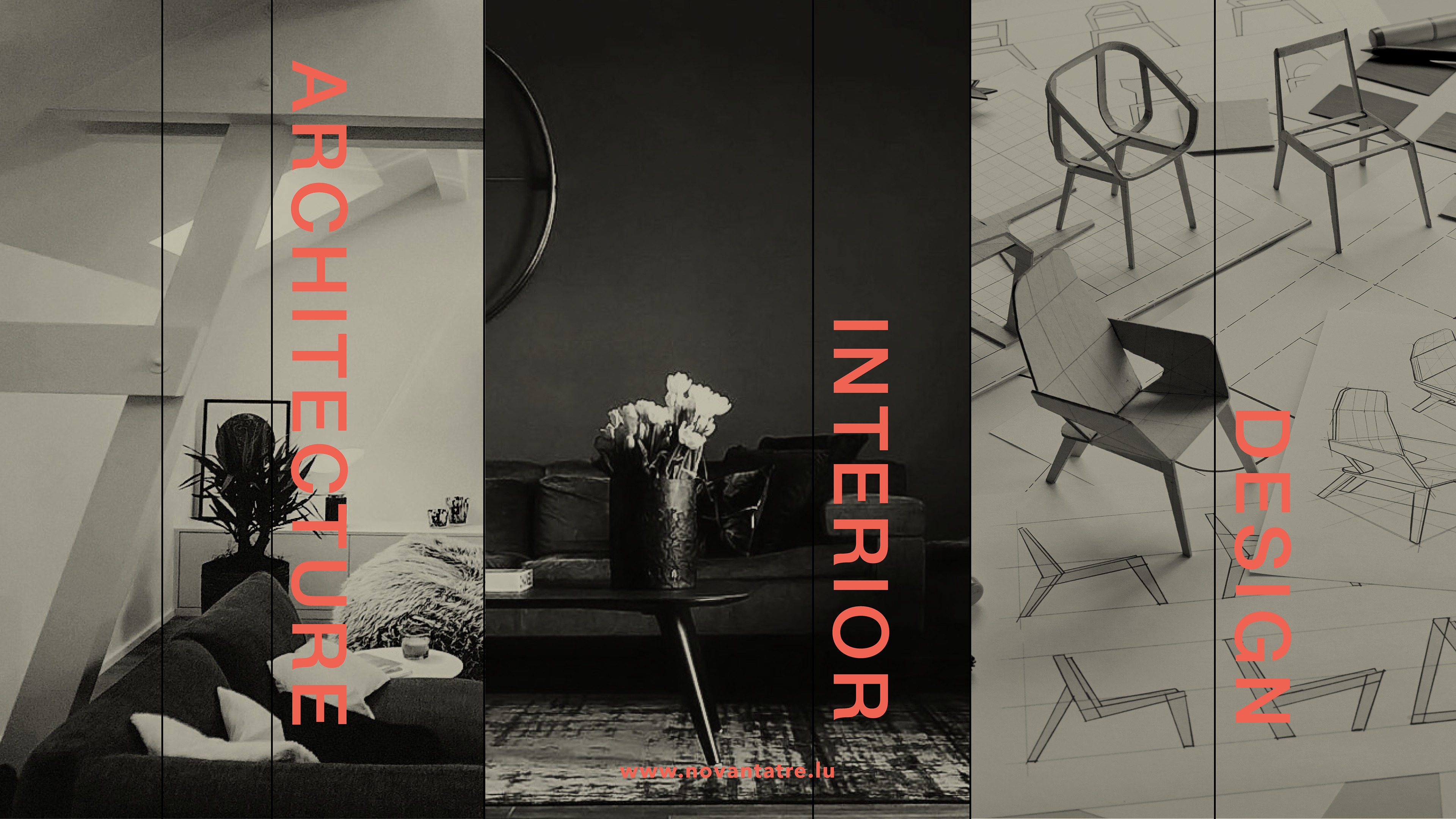
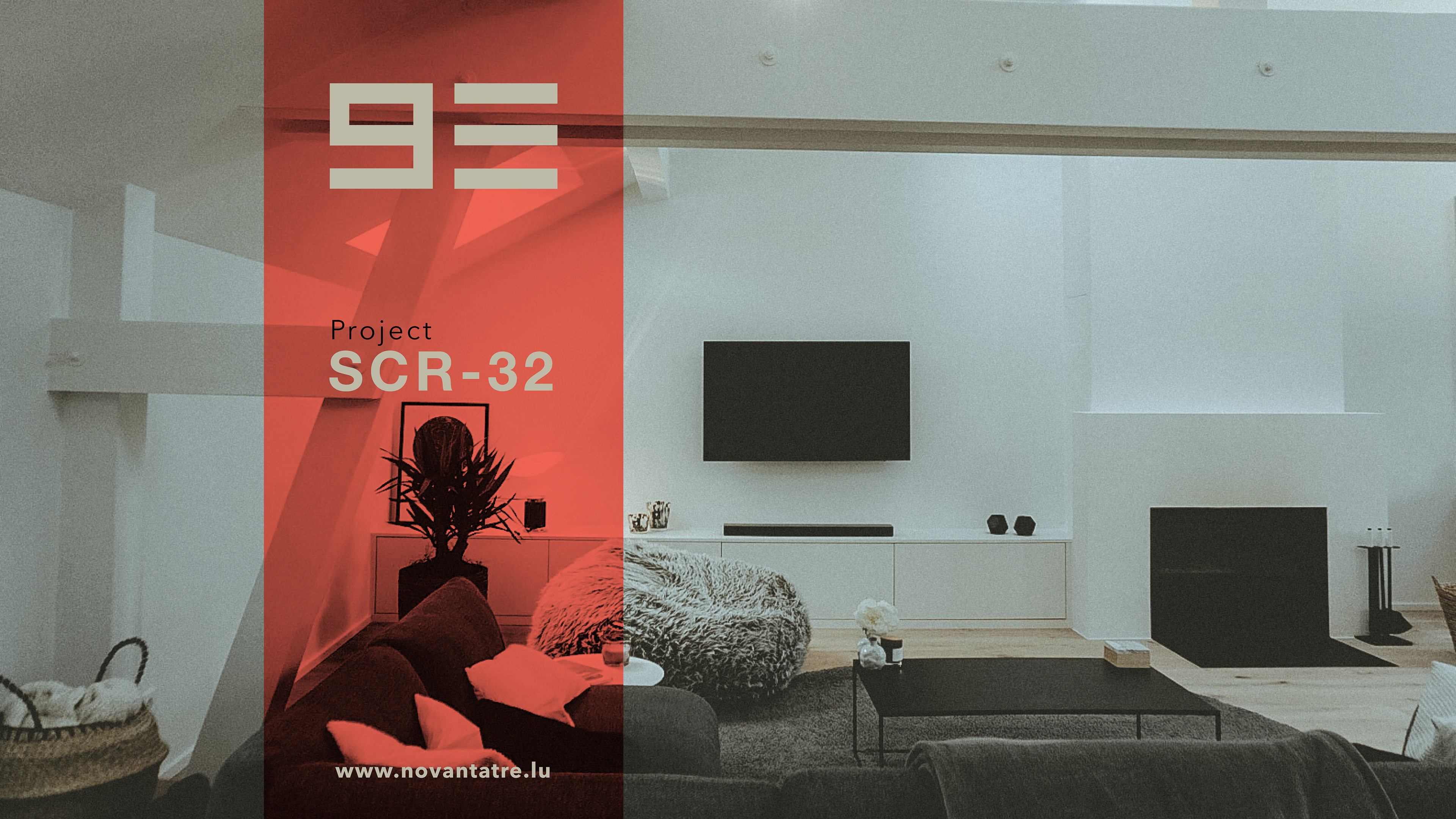

On Instagram, the posts were simply copy/pasted from the Facebook posts except resized for Instagram. I did also create a series of Insta-stories to be presented at the top of the page.
Web Design :
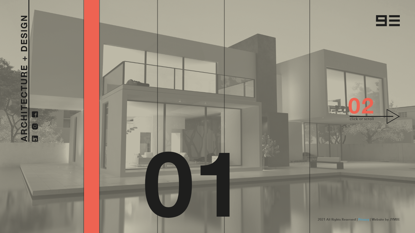
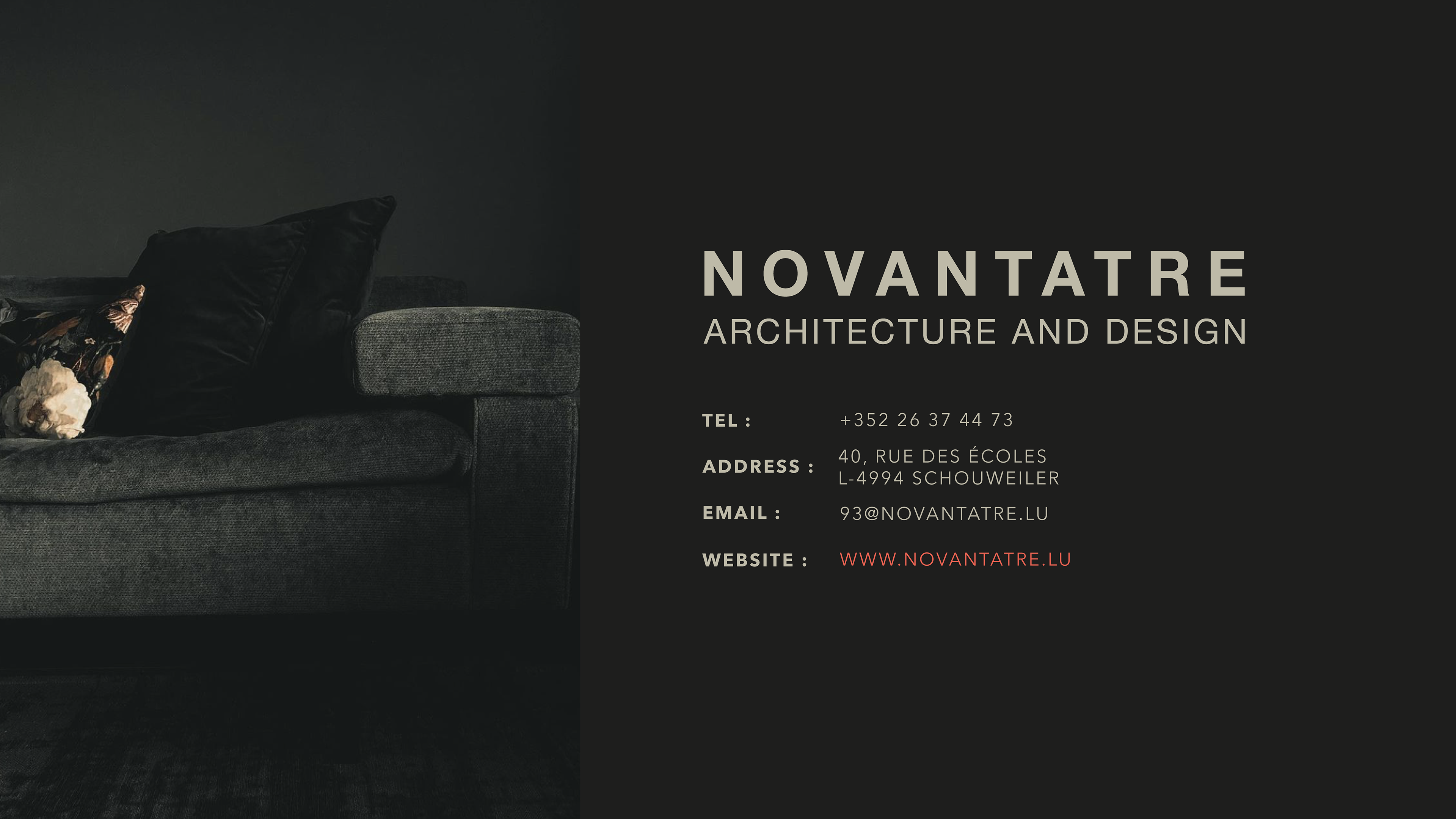
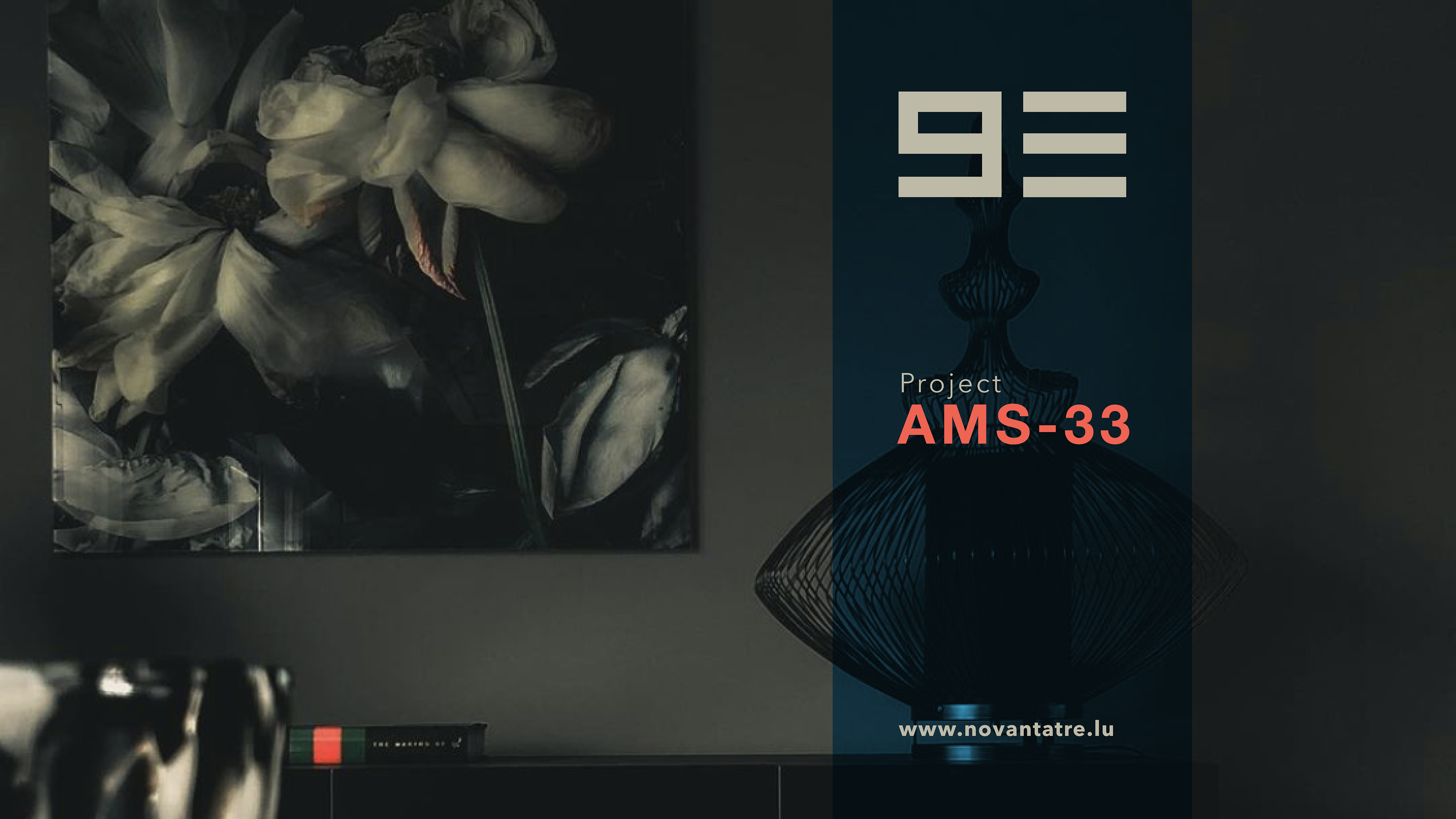
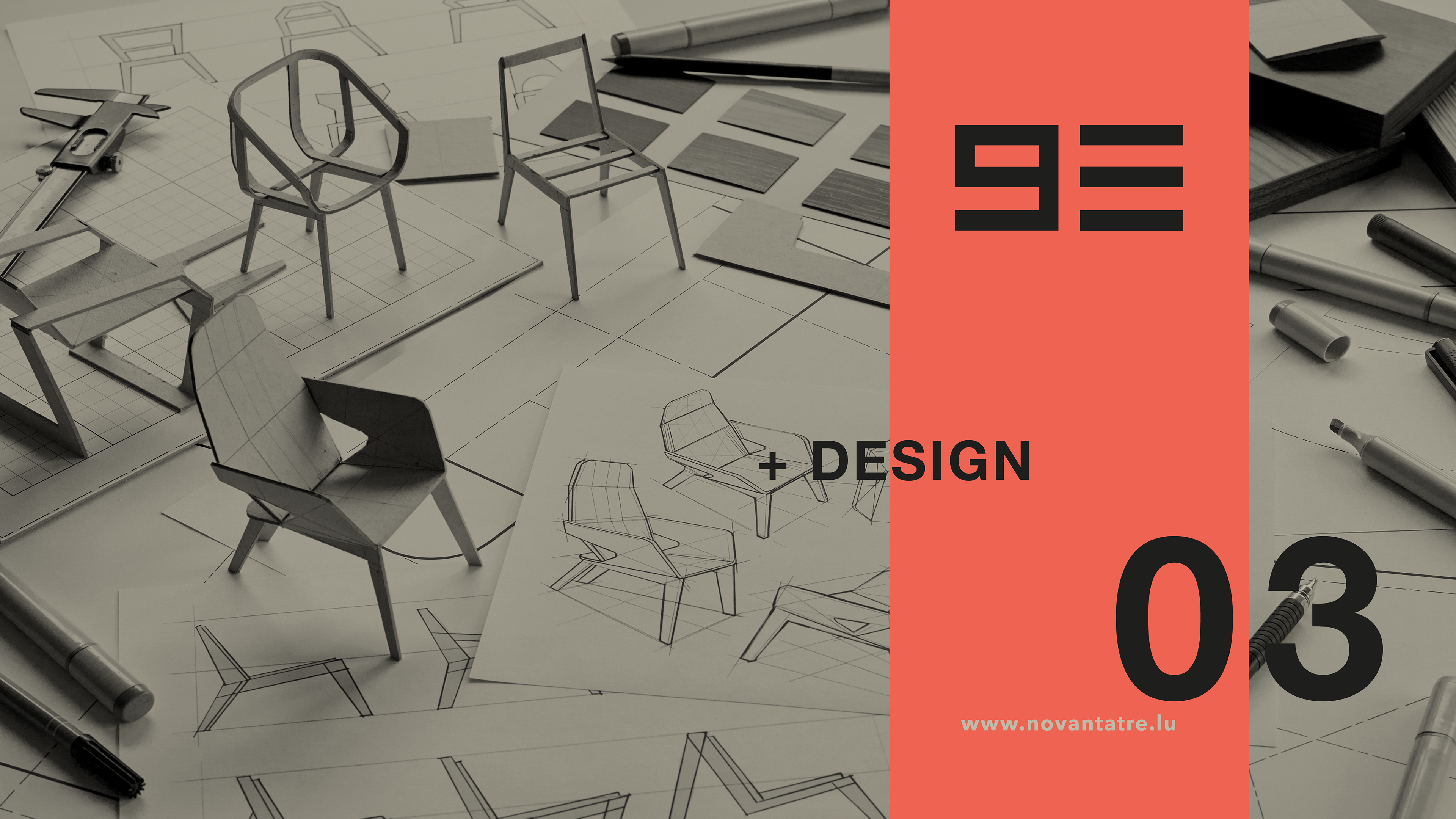
* the final version of what would become the landing page for the website.
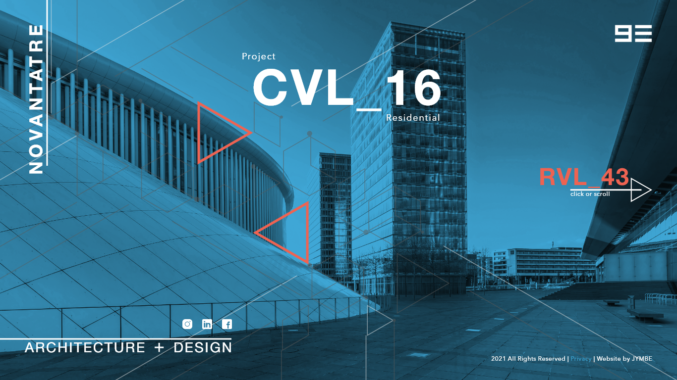
The client wanted something that was unique and different from what everybody else was doing. I instantly thought that a horizontal-scrolling website would be opposite of almost all the websites out there. I began by designing several landing page versions in Xd and submitted for client review.
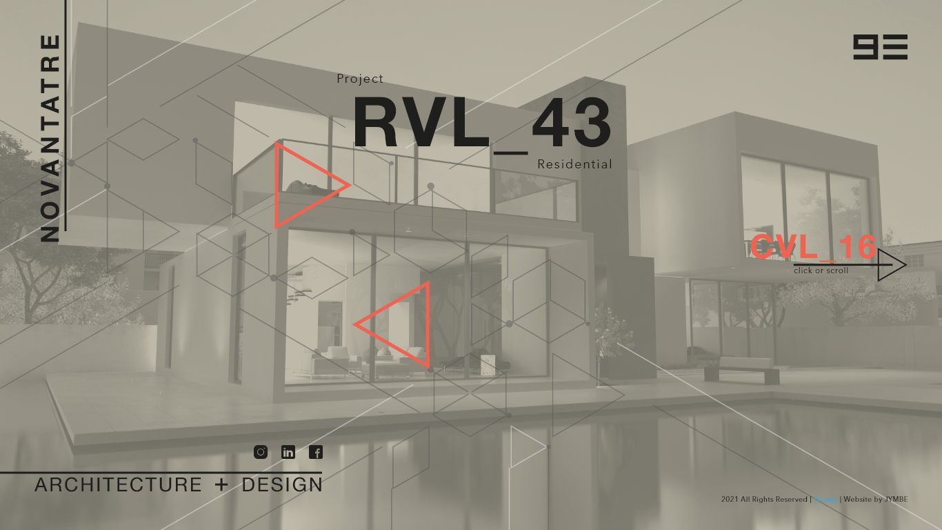
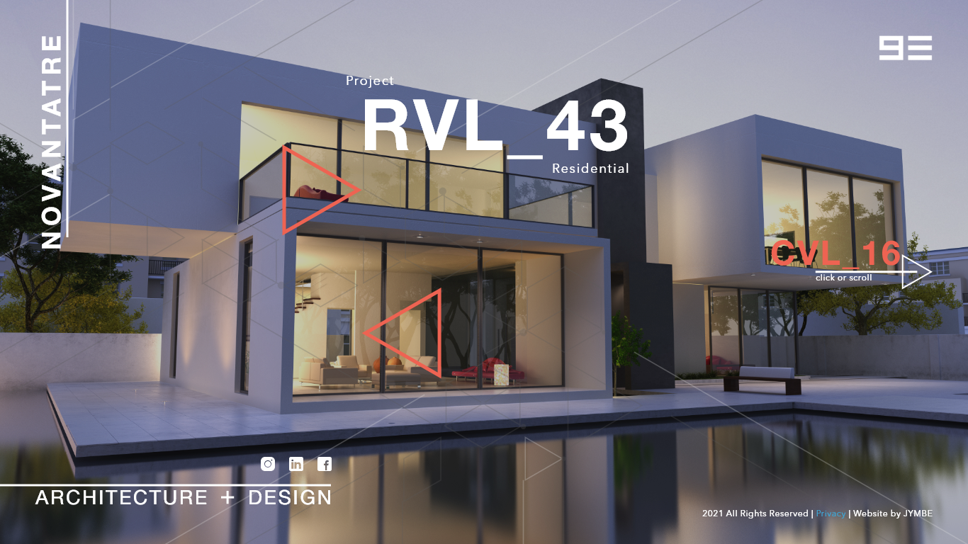
The client had the idea of naming his personal architectural projects in such a manner (01-R, for example), he also specifically asked for a beige color to be the main color. This posed a problem that needed to be solved : how can you showcase the color beige as a main color effectively? I decided to present the website in such a way that it looked almost like paper. Like a printed out sheet, plans or blueprints that one might find on the desk of an architect.
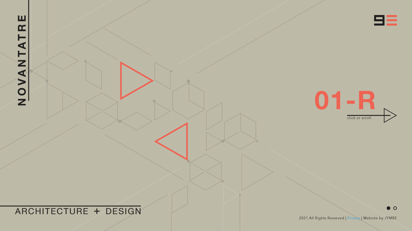
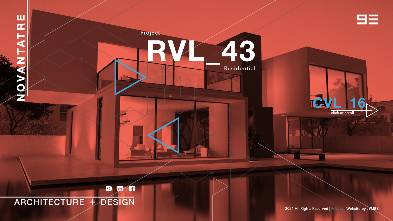
In the end, the client chose a more simplified version of the beige example above. We took the lines and made them bars and used orange as a good action color with good energy and contrast between it and the more subdued beige.
Next was the question of navigation. How could we handle moving through a website in such a unique layout? I decided a full-screen "dropdown" menu with big and bold text would be the way to go.
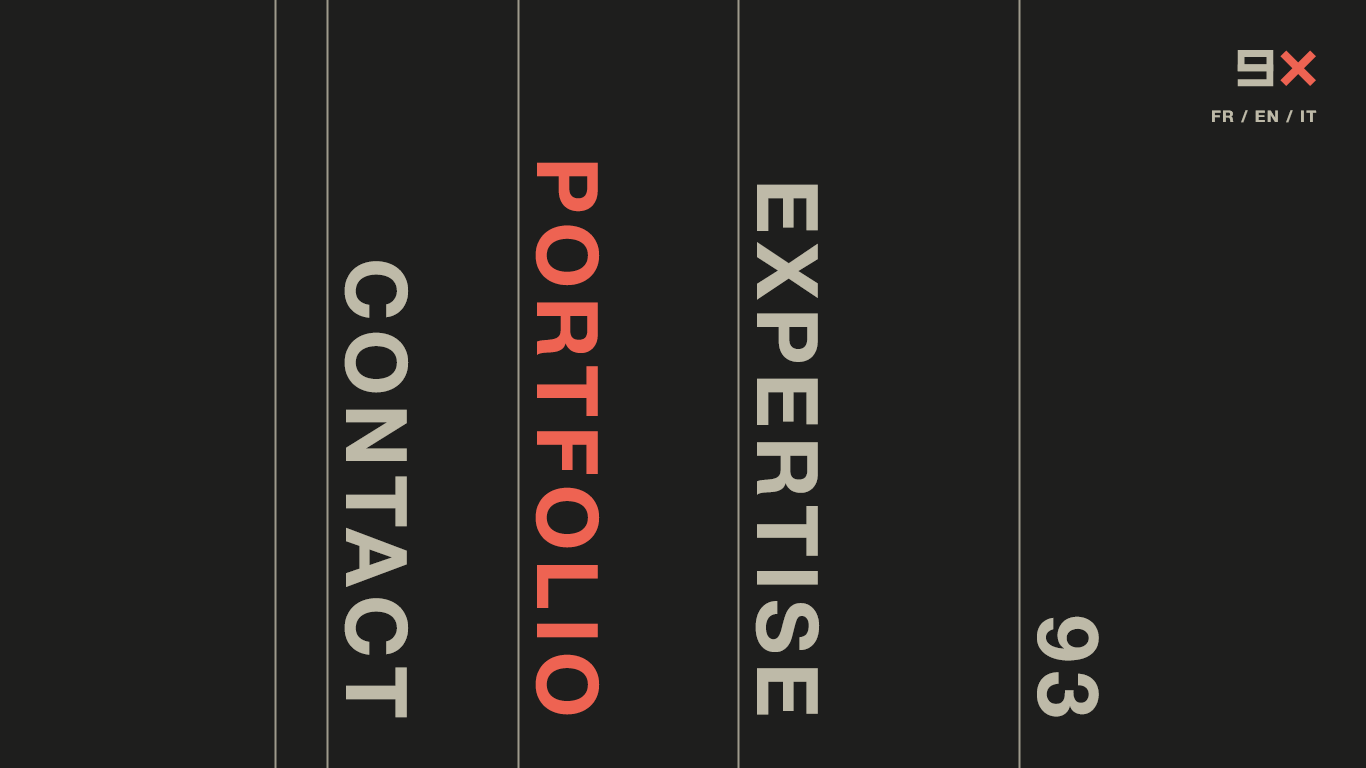
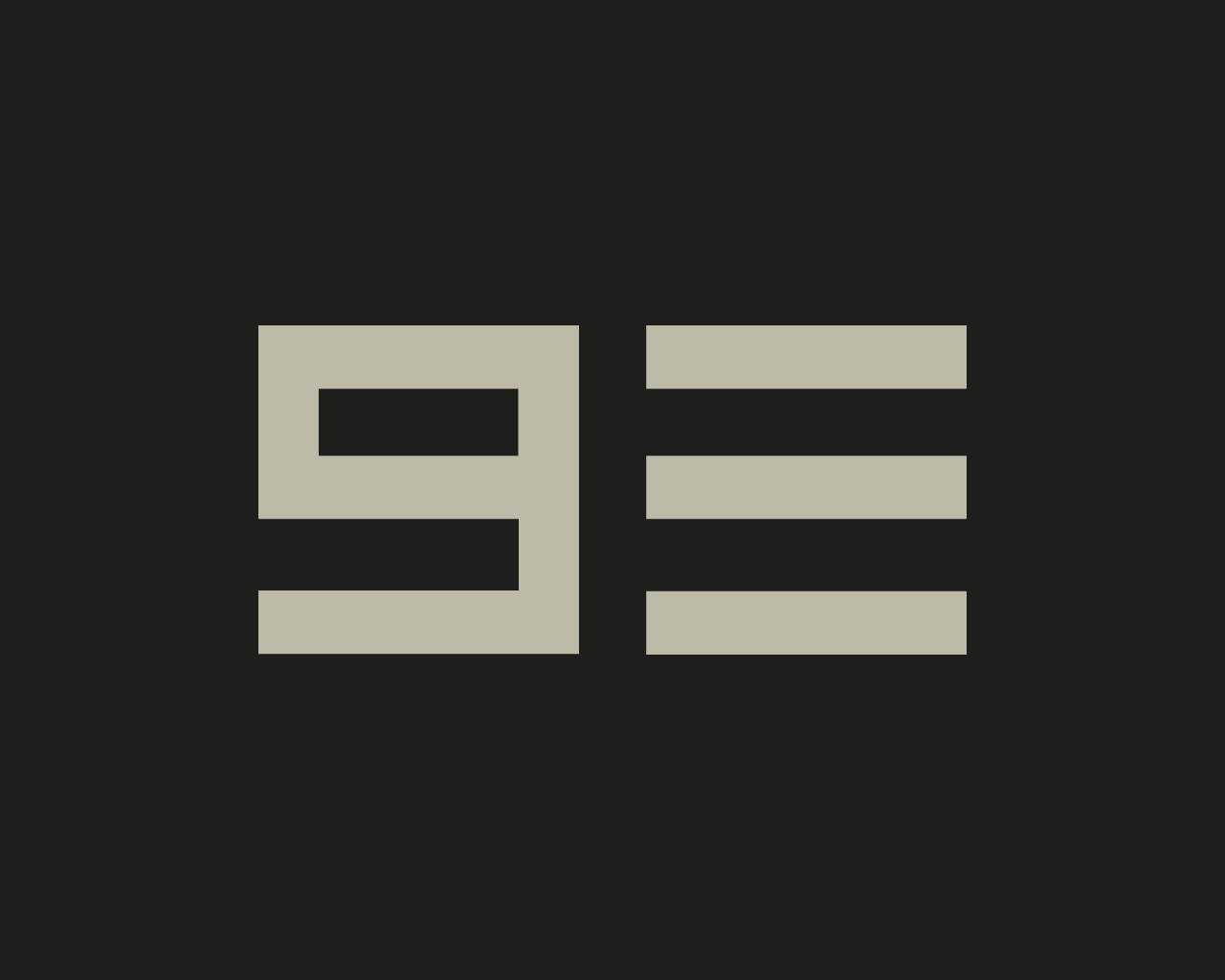
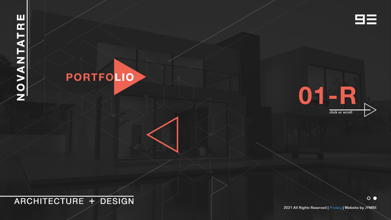
* the idea was to animate the 93 in the corner to form a 9X and then use hover effects and animations to move through the content.
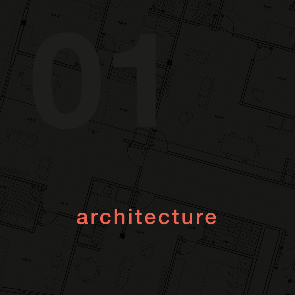
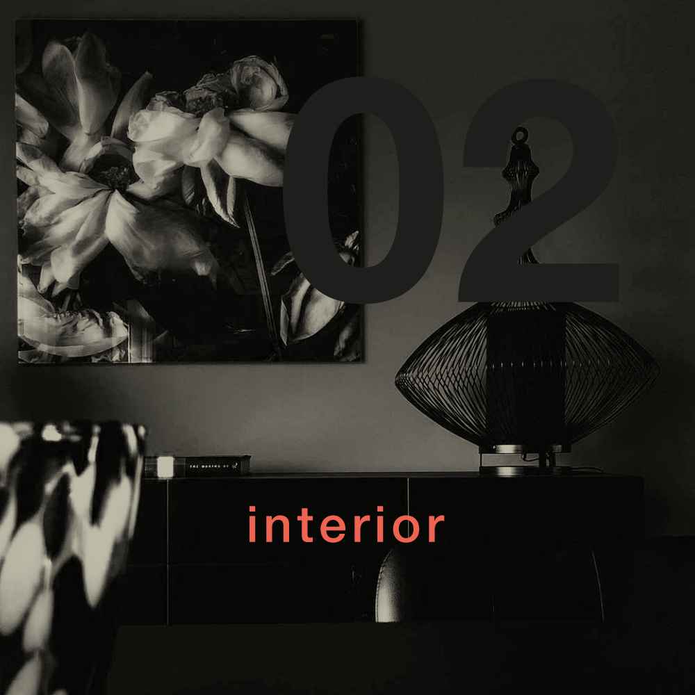
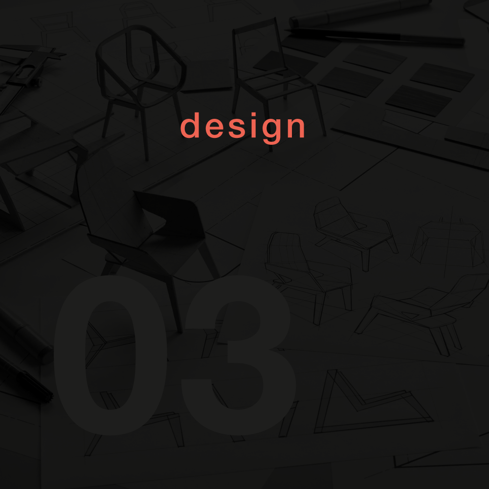
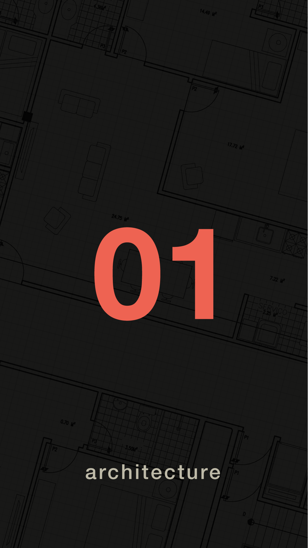
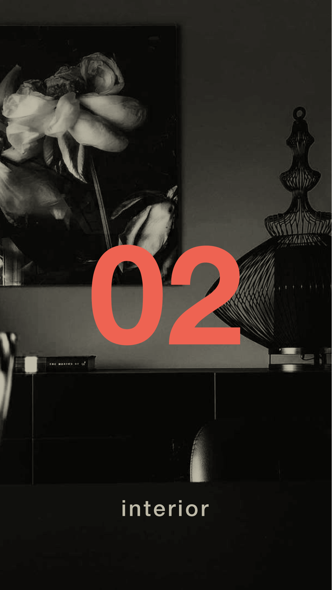
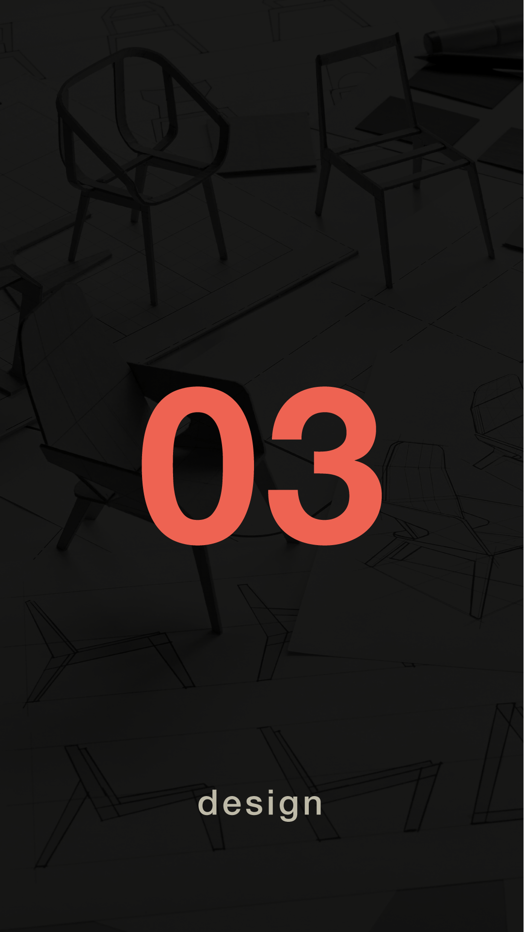
Now, it was time to think about the rest of the site. The client would need an About page, a Portfolio and a Contact page. During the Design Phase of this project, I thought it would be best to present sub-pages in a more simple vertical format, for simplicity as well as the simplicity for coding the site itself during development. In the end, the entire, final site was presented in a horizontal format.
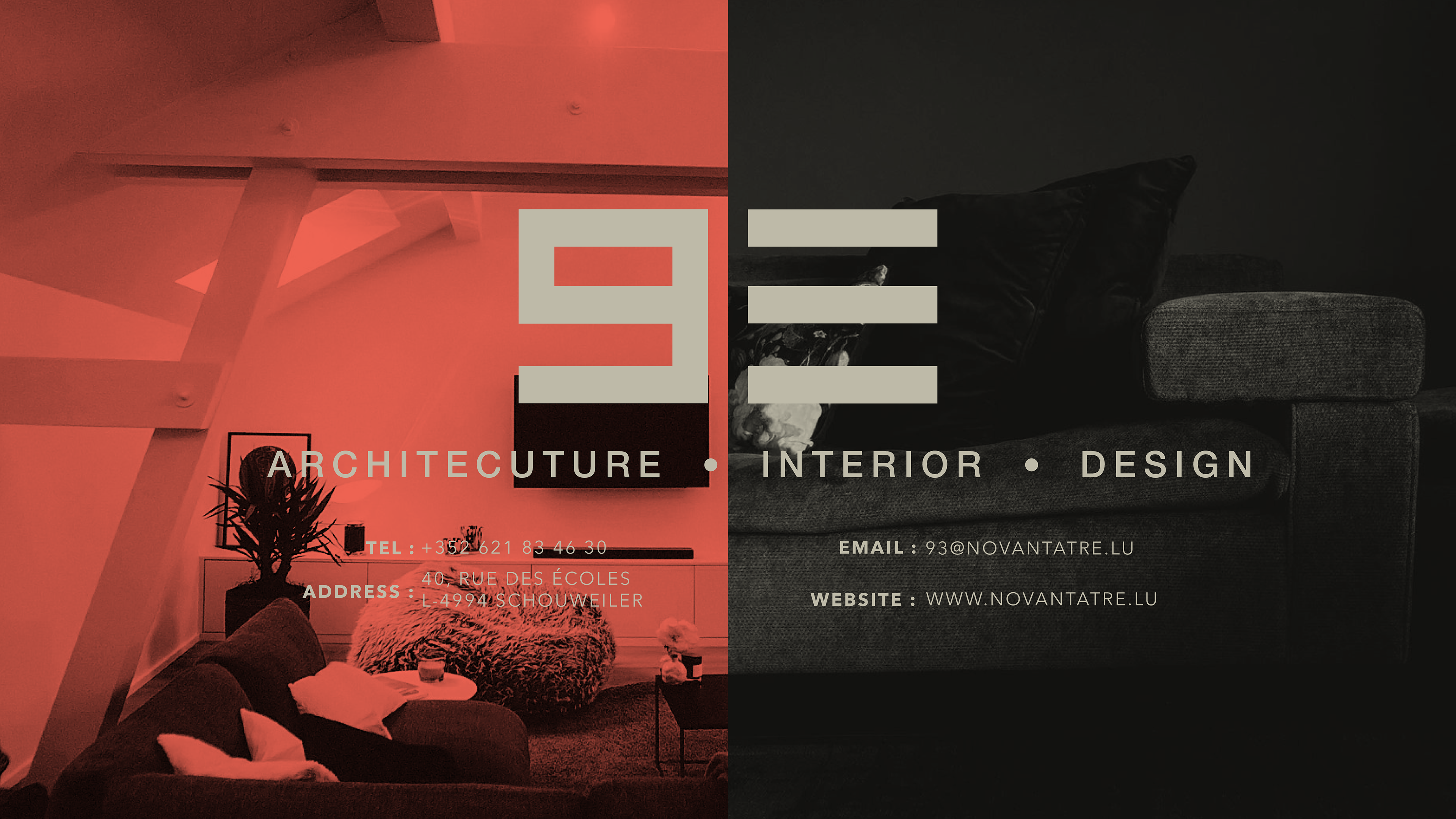
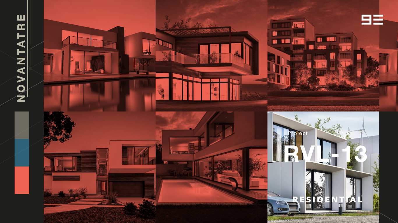
Project Details page :
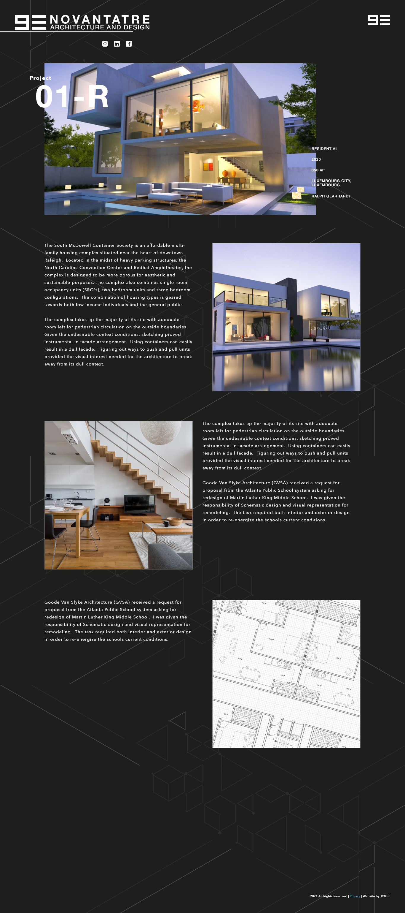
* the initial idea was to move into a vertical format in sub-pages, however this idea was scrapped right before development.
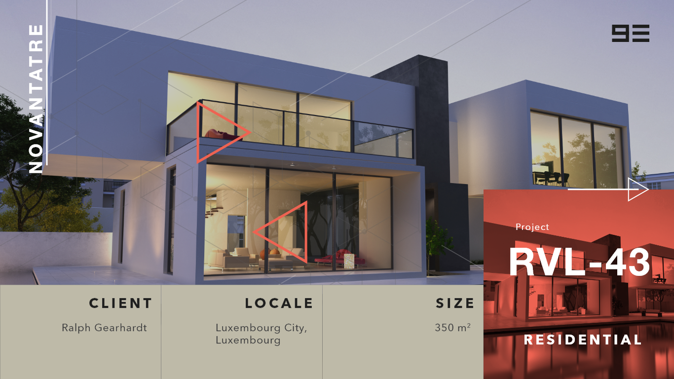

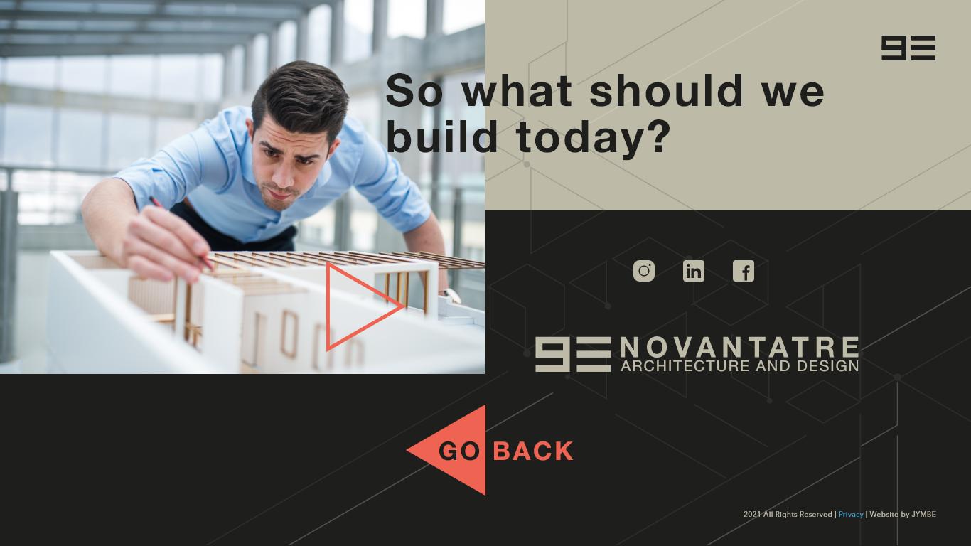
In the end, we kept the horizontal scrolling idea, however the final version was further simplified. I liked the idea of the website feeling like a book with pages that needed to be flipped and I believe the client shared the same vision.
Portfolio page :
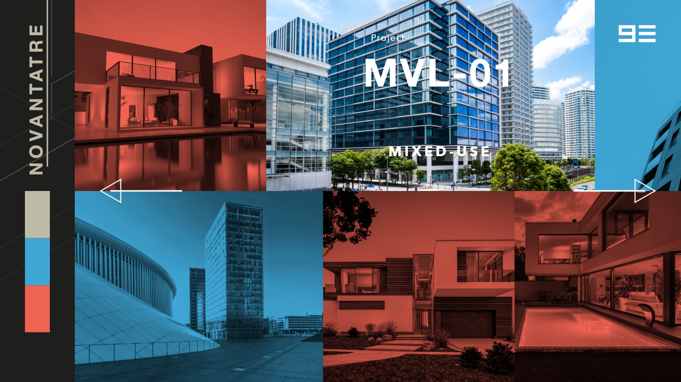
My idea was to present the portfolio in a series of image cards that reveal on hover, in full-color, the project, it's name and some details about it. Clicking/Tapping on the image would lead the user to the project details page above. I added the colors on the side as a sort of filter and color-coded the type of project. Orange : Residential, Blue : Commercial, Beige : Mixed-Use.
In the end, as is often the case, this layout was more simplified as the client did not in the beginning have enough projects to present this portfolio nicely.
93 (about page) :
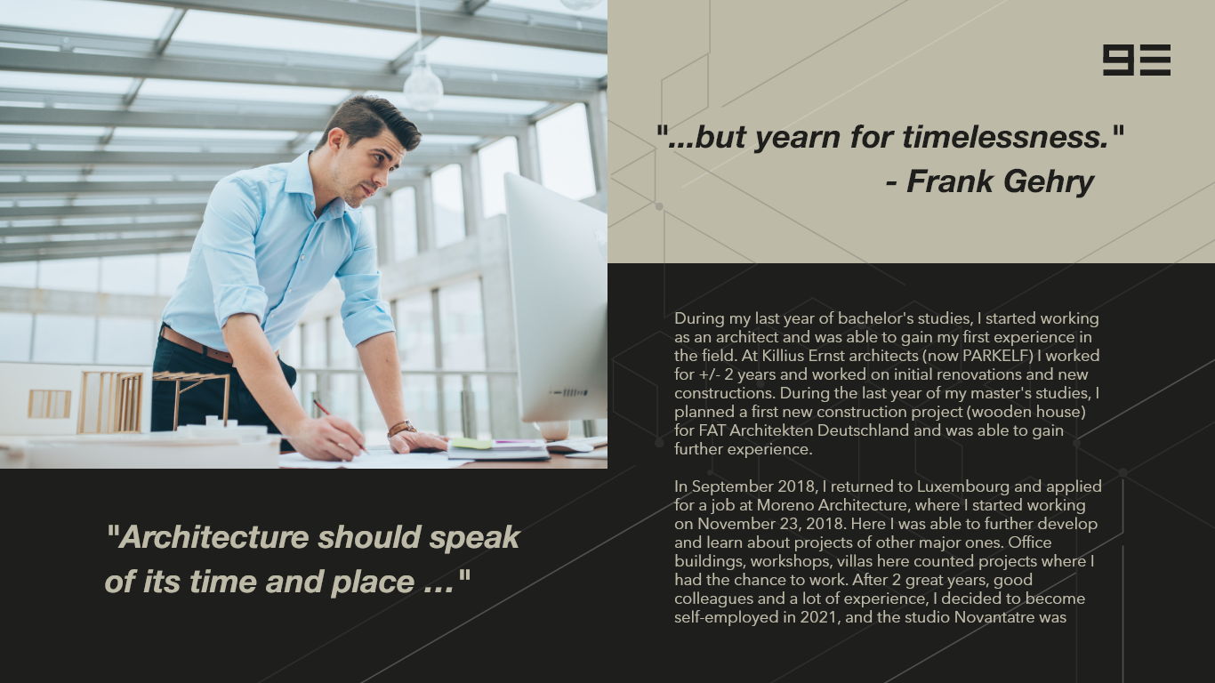
Of course most websites and businesses need an about page. Again, during development the content changed and was further simplified and can be found on the live site.
Contact Form :
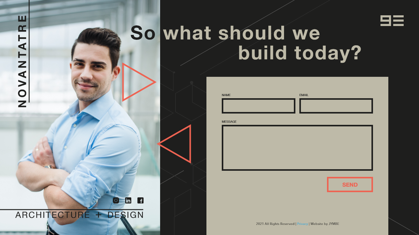
Continuing the "paper" theme, I used boxes and thick lines to present the contact form in a unique manner.
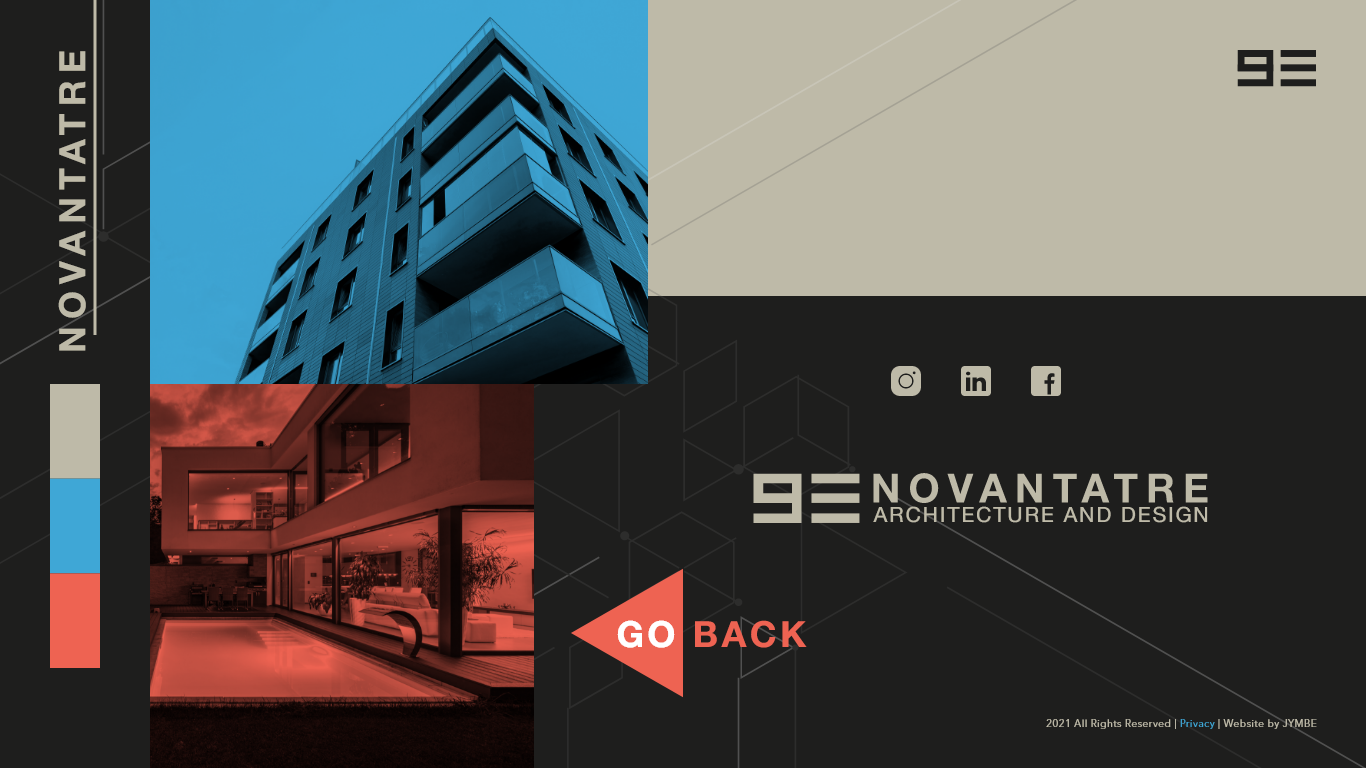
During development, we needed a way to implement the horizontal scrolling effect, so we utilized a framework called fullPage.js and that along with the use of some javascript made a very unique site that I can be proud of! After the site was coded, I had to work with the SEO to make the brand more prevalent online.
LIVE site can be found at : https://www.novantatre.lu/